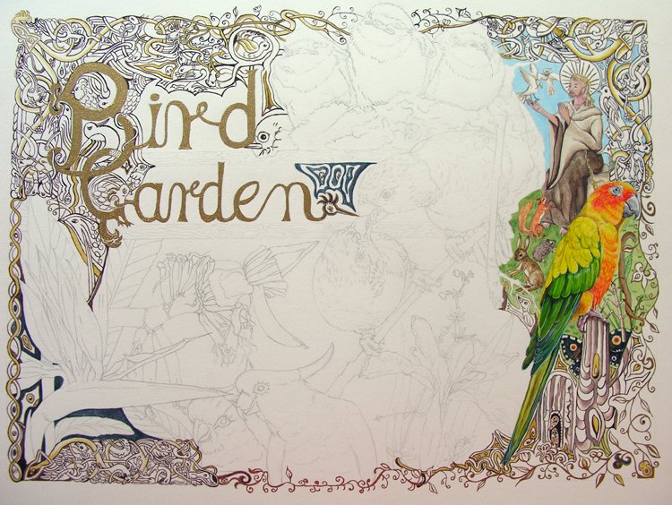
Well – I kept on looking at the Bird Garden Illumination and in the end I just had to add more colour (see previous post on the matter: click here)
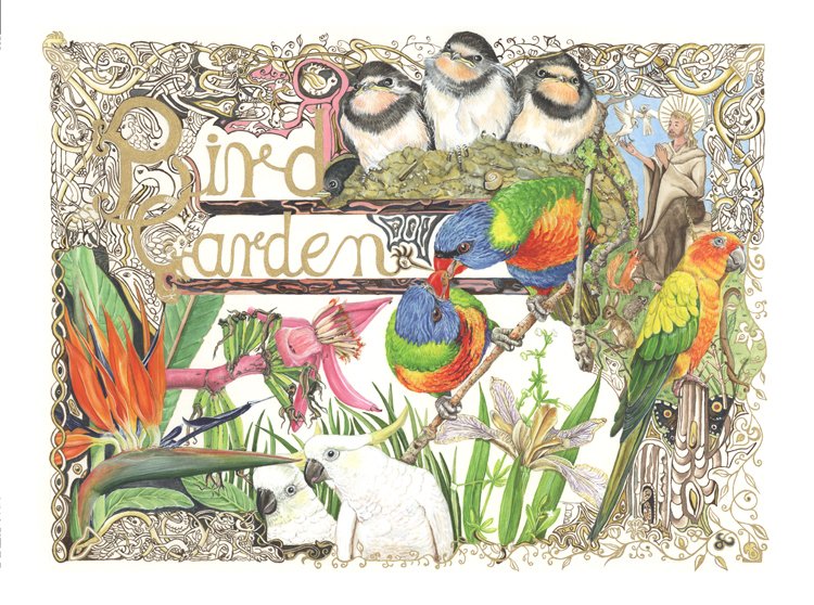
So this is now the finished piece:
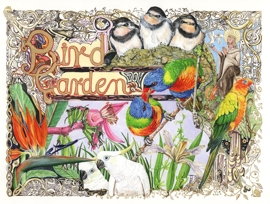
Well – I kept on looking at the Bird Garden Illumination and in the end I just had to add more colour (see previous post on the matter: click here)
So this is now the finished piece:
I have been continuing to try different methods of artwork to illustrate the series of riparian booklets I am producing and co-authoring with Sylvia M Haslam.
Sylvia and I have worked together for many years. I designed a logo specifically for some of her work: “River Friend – To Discover • To Assess • To Conserve • To Save” – a simple but very important message to everyone who is interested in river ecology and its conservation and management. This is the logo, which you may have seen on some publications such as
S.M. Haslam (1997) The River Scene, Ecology and Cultural Heritage, Cambridge University Press, Cambridge, ISBN 0 521 57410 2 Hardback.
S.M. Haslam (2004) River Kbir: the hidden wonder. Typeset and present press-ready files onto CD (for printing in Malta). ISBN 99932-0-295-9
S.M. Haslam (2004): Wied Garnaw in Santa Lucija. A Field Study Guide. Santa Lucija Local Council, Malta. 38pp. ISBN 99932-0-339-4
S.M. Haslam (2002): Our Nature, our Heritage. A Field Study Guide. Ministry of Agriculture, Malta. 52 pp. ISBN 99932-0-204-5
S.M. Haslam (2001): Wied il–Lunziata. A Field Study Guide. Ministry for Gozo, Malta. ISBN 99932-0-086-7
S.M. Haslam (1998): Chadwick Lakes. A Field Study Guide. International Tree Foundation, Malta. 50 pp.
S.M. Haslam, (1991) The Historic River Cobden of Cambridge Press
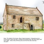
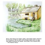
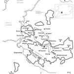
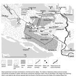
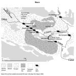
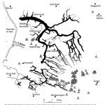
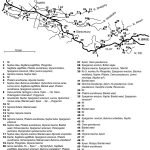
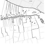
The latest set of artwork is draft pen and ink drawings from photographs taken by Sylvia which illustrate particular things to do with river landscapes. These sketches are specifically for the booklet about the River Brue for which I have already done a few water colour/pen and ink paintings as well as some schematic diagrams drawn by computer (see these below the pen and ink drawings).
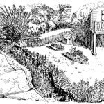
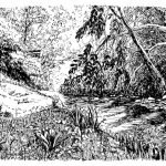
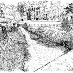
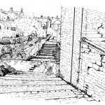
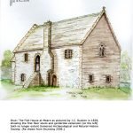
Here are the [draft] drawings and schematic diagrams for the booklet about the River Brue in Somerset:
I keep looking at my “Bird Garden” Illumination and feel that it does need a bit more colour behind the lower half elements (and perhaps even around the words “Bird Garden”. The previous two pictures in the series do not have so much white space, and I am suddenly not happy with all the white space in this one. Watch this space for an update!
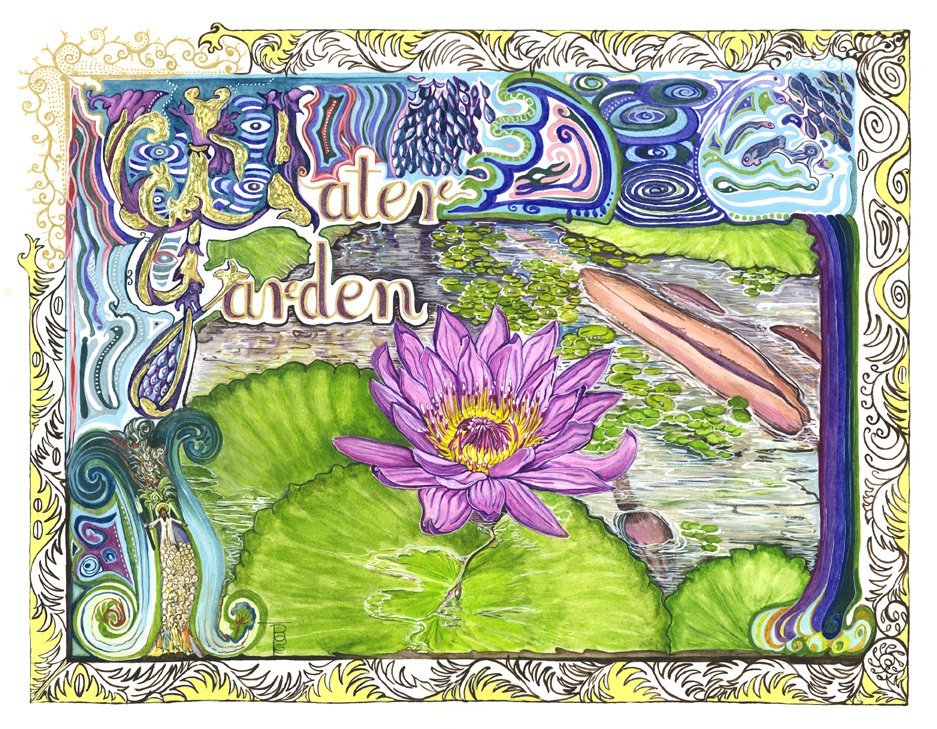
There were some pressing home matters to attend to over the weekend, so I did not get this painting completed by Sunday evening as I had hoped. However, I have just completed it at lunch time today (Wednesday 24th January 2018! (Aren’t Banana flowers most strange?)
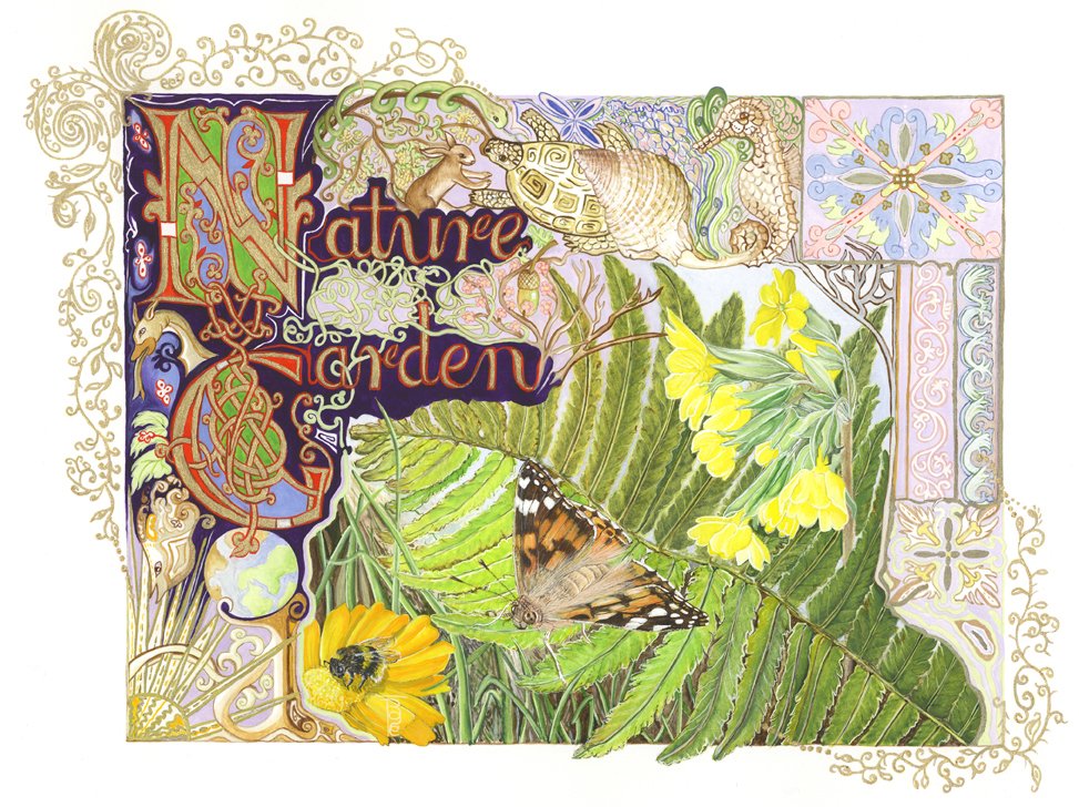
Here is a little film of the progress saga, and the completed painting – albeit a rather poor photograph of the image. The weather again has been awful and natural light is non-existent, hence poor photographs. I usually leave water colours a couple of days on the stretched pad before releasing and scanning them for “extra-curricula” use (prints and cards, etc.). I think this one will make a great Whimsy jigsaw puzzle. An earlier illumination (Nature Garden Picture Profile) was made into a 500-piece conventional jigsaw puzzle, and this one will look really amazing as well as being most difficult to piece together!
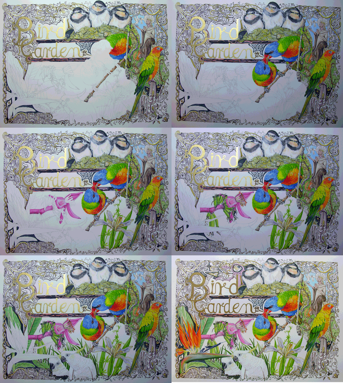
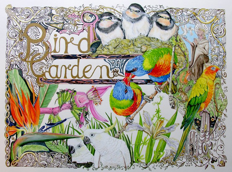
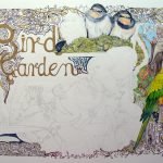
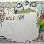
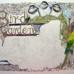
With the lovely sunshine of the last two days, it has made possible quite a bit of painting. Bearing in mind how many hours it takes me to paint a picture, I have made (what I think to be) good progress on the Bird Garden Illumination painting since my last post. I do really need to finish it by the end of this weekend because I now have to turn my hand to the pen & ink drawings for the booklet about the River Brue in Somerset. So apart from playing tennis tonight and tomorrow morning, the rest of the weekend is free for painting – although the light on Sunday looks as if it will be quite dismal! Will keep you posted…
You will see that I have painted in the baby swallows, and many thanks to Alison Grey for the resource photograph (one of many that she has very kindly supplied for my use); and notice the snail shell in amongst the nest gubbins. I did not notice this until I actually started to paint the nest. Upon closer inspection it also contains little stones and sticks – very clever what birds can do with a bit of mud and spit!
Following on from my previous diary entry (link below), I have been utilizing the skills gained by my little Beatrix Potter exercise to produce a few draft drawings and paintings for the series of riparian booklets I am producing with Sylvia M Haslam. We have been researching for the booklets since 2010, and now at last we are almost in a position to publish (provided we can find a publisher of course), subject to my tidying up the text and producing the artworks. It is a real honour to work with Sylvia and I hope I can do justice to the project. I have done three little painting drafts regarding Fish Houses which used to be built to house live fish which had been caught, to keep them fresh until needed for food, as well as a few schematic diagrams drawn on computer with my old Adobe Illustrator programme and a mouse. I have not yet tried the pen and ink drawings which will form the main part of the illustration set, so I will have to produce a few in that media, just to see how I get on and to establish a style which is acceptable for publishing and which suits the booklets.
Here are the [draft] drawings and schematic diagrams for a booklet about the River Brue in Somerset:
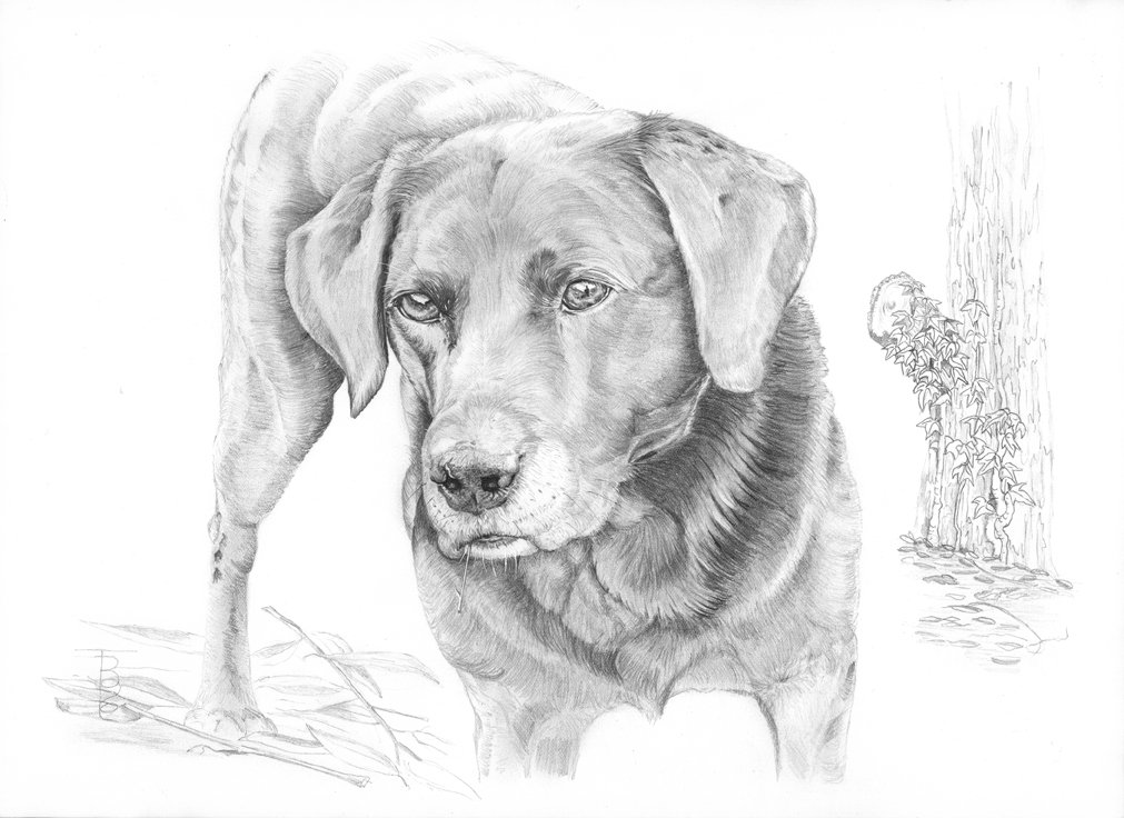
It has been a splendid fortnight for creativity. I also completed a little graphite drawing for someone—a black labrador named “Tara”, whom I went to meet with my camera and took lots of snaps and paid attention to her character. I hope you like it (she is 10 years old, but very sprightly):
I have also been working the last few days on a painting I started in 2016 (I have several pictures drawn out during that year which I never managed to get to paint, so I have decided to make a real effort and complete them if I can. There are about 9 altogether, including a set of squirrel paintings to be done in oil on stretched canvas – black, red, grey and albino/white. I recall it was very interesting to obtain resource material for these. I was fortunate that the black and grey squirrels visited my little garden and the compositions reflect this; the reds resources resulted in a trip with hubby and caravan up to the lake district where the owners of the caravan site on which we stayed have special squirrel feeders which entices the animals down from the trees and gives the “campers” a very good show to watch. The albino was another story, and I am grateful to two of my voyaging friends who captured a few shots of a white squirrel down in Kent somewhere. I have never seen a white squirrel in Cambridgeshire. The current picture I am working on is entitled “Bird Garden”, an illumination with metallic gold letters and filigree. Today I completed the parrot on the right hand side. I will post updates when I can.
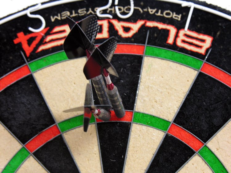
And last but not least, I may have mentioned that I play darts with a local team of ladies. We always finish last in the league and have a fabulous wooden spoon trophy with our name on it. But that does not dent our enthusiasm for the game and we always have a lovely time playing, getting beaten, and then having a fabulous pub “nosh-up” afterwards. I do have a dartboard up in my office and I practice whenever I can (not that it does me any good, but it keeps me moving about when I sit down for a long time at the computer or painting). I could not believe that in October 2017 I actually achieved a 180 – which if one achieves that during a match your name goes into the “Hall of Fame” on Facebook! But of course there was no one here to witness it, so for posterity I took a photograph, and this is it (I promise)! Howzat!
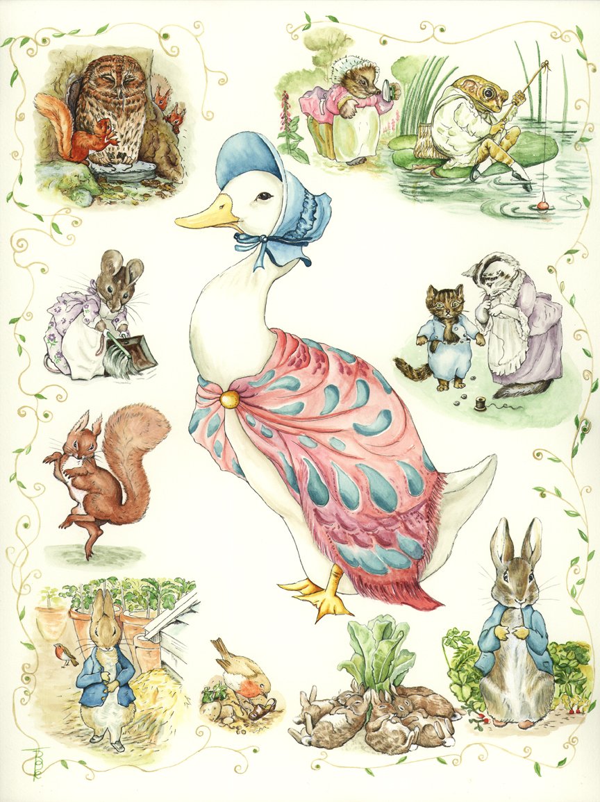
You may be aware that I am in the process of producing the artwork for a series of riparian booklets with my co-author, Sylvia Haslam. For some time I have been wondering how I would like to produce the illustrations and suddenly thought about the work of Beatrix Potter, whom I believe was a great artist in her field of simple but effective illustrations. BP’s natural history pieces and her realm of fantasy animal characters show just how skilled she was. They say that all artists can improve their skills by copying the “Masters” – and I place BP in this category”. I decided to delve into her work in detail, finding out as much as I could about how she painted. I discovered that she only used 6 colours, which I managed to purchase, namely: Antwerp Blue, Crimson Lake, Gamboge Yellow, Sap Green and Burnt Sienna, as well as a bit of White if she made a mistake!
The worst part of this exercise for me personally is that I love to use white (Titanium mostly) rather than leave white space on the paper, and I must confess that I did use a bit here and there for emphasis, but mostly I was pleased that I managed to be good and leave the white space.
Although I tried to find out if BP painted first and inked in afterwards, I was unable to obtain the information. I went with my gut feeling and inked in over the paint. I liked the effect! This has been a truly remarkable learning curve and wonderful exercise in the art of water colouring.
This is the artwork which I produced; I do hope you like it.
Picture Exercise Profile Link
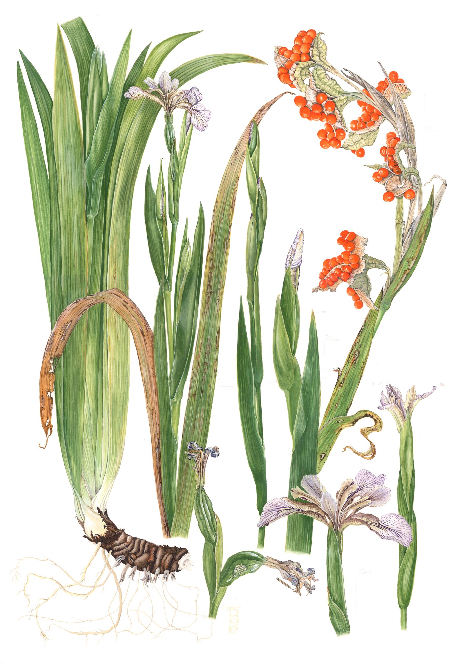
I had been asked by ABBA to send a little study case about the preparation and painting of my Stinking Iris picture for their website. However, as mentioned in my previous post, I sent them the wrong image for the selection process (very strict rules), so the picture did not make it at all! But I do like the finished artwork – much more than I do the bluebells (1703 ABBA Website story), which did go through the selection process but which was not good enough at the end of the day to be included in the final round – and thought I would let all my readers see the post I sent which of course was not then published. I hope you enjoy the picture’s creation journey.
“Stinking Iris” (Iris foetidissima)
Water colour completed 15th October 2017, Artist Code: 1704
Painted on Aquarelle Arches hot pressed 140lb 100% cotton rag paper, size: 14″ x 20″.
I started this project in June 2017 (during the middle of painting my other submission, the English Bluebell which I took on at the request of ABBA because the original artist could not complete the project) when the Iris flowers suddenly bloomed earlier than expected. There was no need for a field trip to find a specimen as they grow in my little wild back garden. There are only two kinds of native English Iris, and this one likes shady, damp spots. It is a very vigorous plant in the right conditions and thrives in our green and pleasant land. Its name “Stinking Iris” comes from the putrid smell of bad raw meat which is emitted when the leaves are crushed. It also has a few other local names. (The other native Iris, which thrives by waters edge, is the Yellow Iris, Iris pseudacorus.) The first photograph shows my preliminary notes and colour mixes. I mixed a lot of the green which came in very handy when I had to complete the painting in October, four months later.
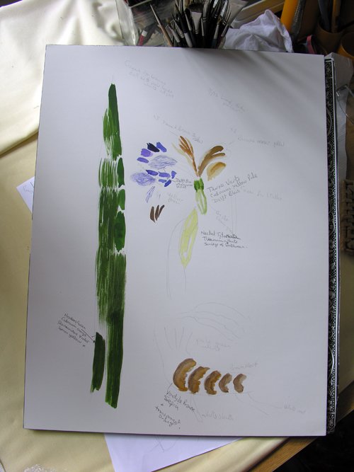
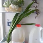
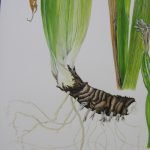
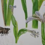
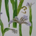
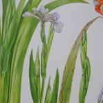
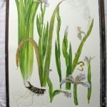
Here are a few photographs of the live material available to me, and which I used to compose the artwork. There are plant close-ups, as well as pictures of my desk and live specimens, and one picture shows the store of flowers in the fridge—which helps to keep them fresh for many days.
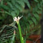
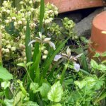
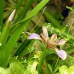
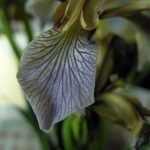
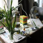
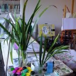
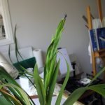
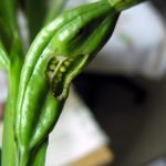
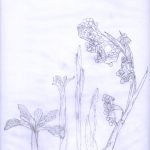
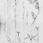
My preliminary drawings took many turns, and after a lot of trials and tribulations I settled upon a suitable study which showed all the things I wished to portray, in what I think is a nice composition. The first photo shows a few elements on tracing paper; the second these and other elements cut up and arranged on my water colour paper; and the third the final [enhanced] traced composition on the paper.
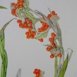
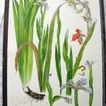
Next I decided to paint first the flowers and buds whilst the specimens were still fresh. In reality, the flowers only last a couple of days before they start to curl up and fragment to decay, whilst beginning to form the seed pods. I put the painting away after working on it for nearly a month because I needed to wait for the seed pods to appear, ripen and split to reveal the beautiful bright orange seeds which line the broken capsule. The plant holds on to these during the winter.
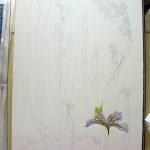
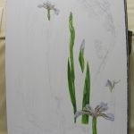
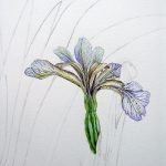
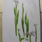
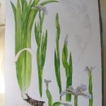
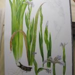
Unfortunately (and this does sometimes happen), the source from where I had hoped to get my mature seed pods did not materialize as the gardener removed all the seed heads before they matured so that my friend’s garden would not become overrun with the plant. I had used up all my flowers to draw and paint the first phase of the picture so had no seed heads in my own little garden. Fortunately, I did a project about the plants in my local Watts Wood a few years ago and recalled that there were some Stinking Iris plants just inside the entrance to the wood. Upon walking to the wood with my bag and scissors I was grateful that the original plants had spread and that there were quite a few seed heads so I cut a couple for my use. I shall sprinkle the seeds in my garden under some trees in the hope of getting more to grow in future.
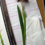
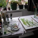
In Early October with seed pods burst and all a-splendour, this is where the green I mentioned above came in very handy. I always mix too much colour for paintings when great coverage is required and I had mixed in June enough of the “body” green for this painting. I stored the surplus colour in a tiny preserve jar in a dark drawer ready for coming out for completion of the picture. As you can see, the green remains in the leaves of the seed-head stems, although it is starting to decay with yellow and brown patches. But as I was completing the picture, and before I started the lovely orange seeds I felt that I should put in another leaf to the left side of the root block of leaves. Even though the tuber and its leaves I had chosen to portray were fairly upright and tight, the leaves of the Iris characteristically fan out gently; so this extra leaf is an indicator of that fanning—albeit very subtle!
The final photographs show the stage-painting of the seeds as well as a few close-ups of some of the elements. The large flower head bottom right, and the large stalk and bud above it, together with the seed-head stem, have scale bars as these were drawn slightly larger than life to give a clearer view. (You have probably noticed that some of the photographs are a bit “wonky”! This is because the camera lens distorts the straight edges. I am not able to stop this with my limited knowledge of taking pictures. (You can read the The English Bluebell entry blog on the ABBA website here. The Bluebell picture was also included in the header pictures on the ABBA website until my painting was not selected—this is what it looked like VIEW.
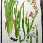
And this is the finished painting:
Well some doors just get slammed in your face and this morning that did happen to me (see below). But I always firmly believe that doors shut and others open, so I always try to make the best of whatever comes my way, whether good or bad.
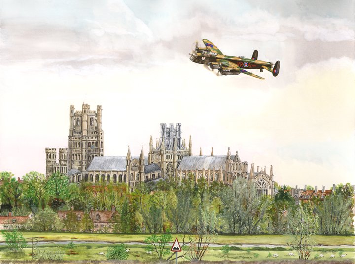
The good news is that I managed to complete a commission which I had to carry over from last year due to my taking a sabbatical year during 2017, and was so grateful and pleased that the commissioner likes it—which does wonders for painting morale!
This is the painting:
The bad news is as follows (although not all bad, as now I have two extra artworks for sale that otherwise would have been tied up for another six months). But I do send my best wishes to ABBA for a successful exhibition in May 2018 and my congratulations to all those botanical artists who made it through.
“On 18 Dec 2017, at 07:03, britbotart 2018 <britbotart@gmail.com> wrote:
My Bluebell Painting View Picture Profile
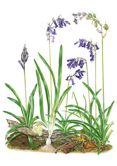
Dear Tina, Many thanks for submitting painting/s in the first stage of judging for the Botanical Art Worldwide Exhibition. The judges have now completed the first assessment and have made the following decisions. Please appreciate that no further comments can be made and the judge’s decision is final. Your painting Hyacinthoides non-scripta was not successful in reaching the second stage of judging and these are the judges comments: There are some very good areas within this painting but there does need to be more attention to details, particularly in the accurate depiction of bended and twisted leaves, the roots, and the inclusion and execution of an insect. Best wishes
The ABBA Steering Committee
Association of British Botanical Artists
Website: https://www.britishbotanicalartists.com/
Facebook: https://www.facebook.com/AssociationBritishBotanicalArtists
Botanical Art Worldwide 2018
In Ruskin’s Footsteps – ‘Linking people to plants through botanical art’
And my second painting for this exhibition was killed before it started:
My Stinking Iris painting View Picture Profile
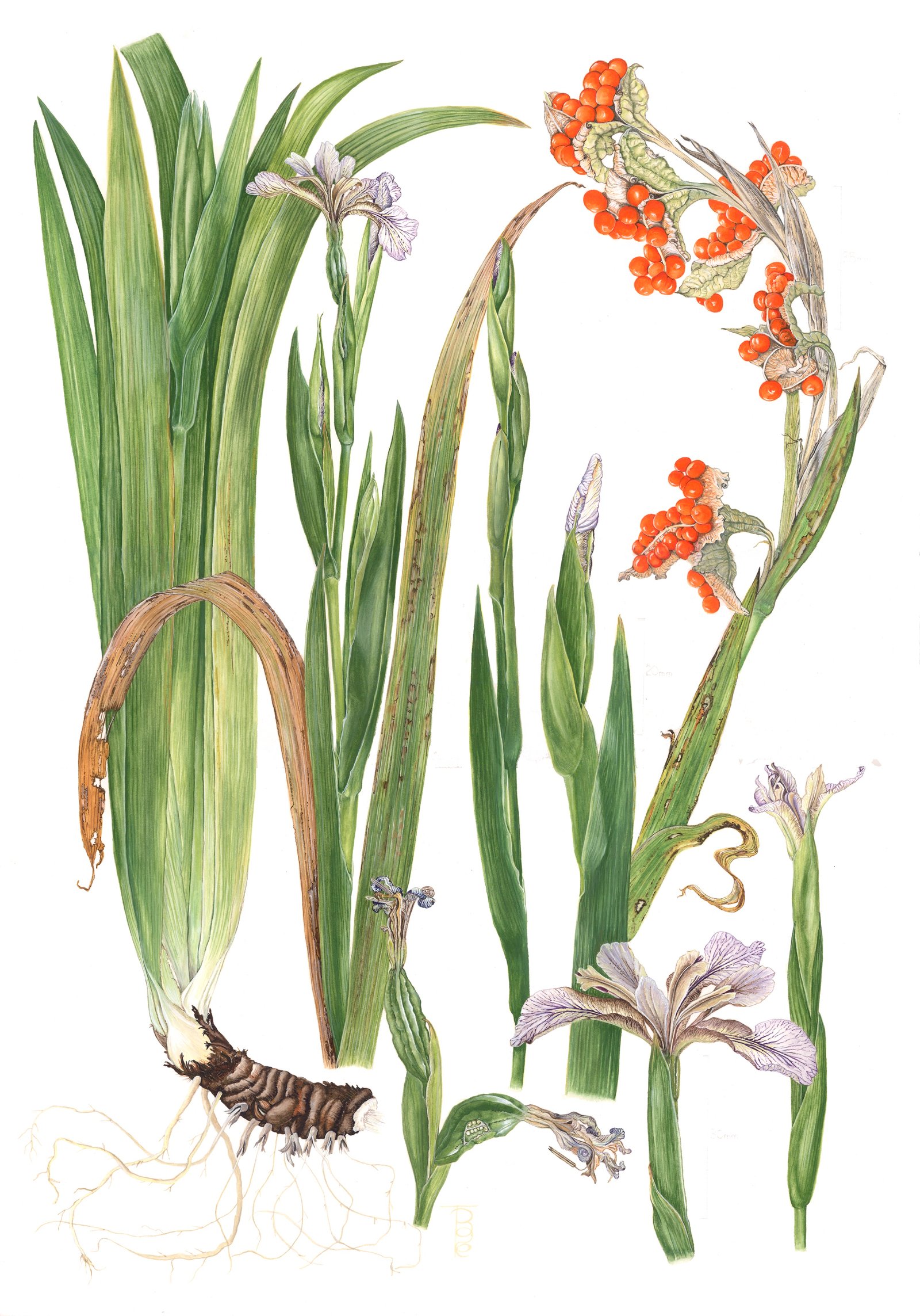
This painting did not even go before the jury because I sent in a digital file which I had pieced together for my website and print production because my scanner was not big enough to scan the painting in one go—this was not allowed. I had meant to send a photograph but got my files muddled up and see below for the “naughty-step” email which, even though I had sent my entry in a few weeks before, I only received on the day of entry closing and was out playing golf so did not get back in time to send the unadulterated image before 12 noon:
On 26 Nov 2017, at 21:59, britbotart 2018 <britbotart@gmail.com> wrote:
Hei Tina, I am sorry to say that we cannot include your picture as it stands, in the judging process. As you know we emailed artists about the criteria for digital submissions to the Worldwide Botanical Art Exhibition. Our criteria are similar to those often used in digital submissions where judging is part of the process. That email said that the pictures ‘MUST be representative of your work. The digital images must not be enhanced in any way, or added to digitally’. We also said that images found to be enhanced would be excluded from the judging process. We have carefully checked the digital image of your submission ‘Scarlet-berry Iris’ and find that the picture seems digitally enhanced. The scale bars and the sizing appear to have been added digitally, over what look like the remains of hand-written scale bars and measurements. Your picture appears to be very well done in every other way, but were we to accept a digitally enhanced picture it might be perceived to have an unfair advantage over other submissions. So as I said, I am sorry that we cannot include your image for judging. But, we will meet tomorrow morning as we collate the digital images for the judges. If you can get a new image to us by midday, we will be pleased to have another look at it for you. Best wishes, ABBA Steering group.
Link to previous post on this Exhibition: ABBA Post
Link to first update for this Exhibition: First ABBA Update
…And the sun is shining beautifully today and my sister and brother-in-law are coming to lunch so all is well on the most important fronts!!!! Have a nice day 🙂
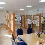
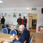
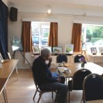
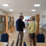
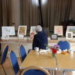
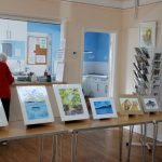
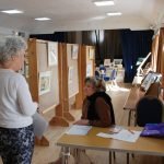
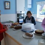
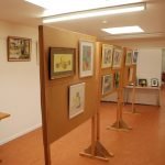
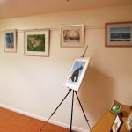
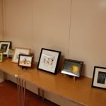
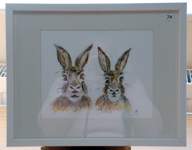
I was delighted to be invited to submit some work to this brand new exhibition in the Village Hall at Dry Drayton (location) this weekend (7th and 8th October 2017). Admission is free and the exhibition is open from 11.00am to 4.00pm. Do go along and visit if you can – the paintings are beautifully set out with lots of room and the [obligatory to try] home made cakes and beverages round the visit off nicely. My husband, David, and I visited yesterday just before it opened (artist’s privilege!) and had a nice piece of cake and cup of coffee – absolutely delicious. We then viewed all the paintings – a wonderful start to our day. After we had enjoyed the artwork, David and I went on to the Ploughing Festival at Prickwillow Pump Museum – but that is another story!
This is my favourite painting from the exhibition:
And here are a few more photographs showing the exhibition layout and lovely homemade cakes.