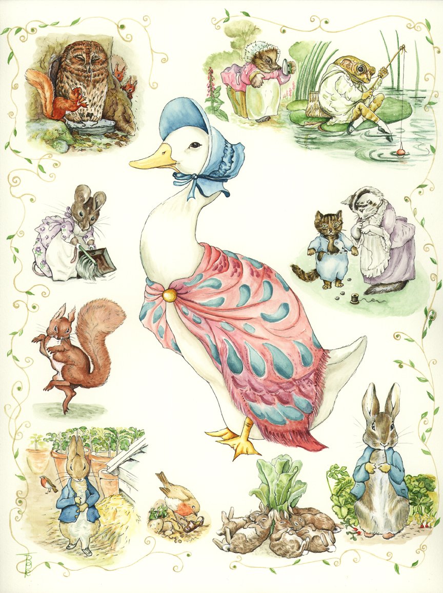
You may be aware that I am in the process of producing the artwork for a series of riparian booklets with my co-author, Sylvia Haslam. For some time I have been wondering how I would like to produce the illustrations and suddenly thought about the work of Beatrix Potter, whom I believe was a great artist in her field of simple but effective illustrations. BP’s natural history pieces and her realm of fantasy animal characters show just how skilled she was. They say that all artists can improve their skills by copying the “Masters” – and I place BP in this category”. I decided to delve into her work in detail, finding out as much as I could about how she painted. I discovered that she only used 6 colours, which I managed to purchase, namely: Antwerp Blue, Crimson Lake, Gamboge Yellow, Sap Green and Burnt Sienna, as well as a bit of White if she made a mistake!
The worst part of this exercise for me personally is that I love to use white (Titanium mostly) rather than leave white space on the paper, and I must confess that I did use a bit here and there for emphasis, but mostly I was pleased that I managed to be good and leave the white space.
Although I tried to find out if BP painted first and inked in afterwards, I was unable to obtain the information. I went with my gut feeling and inked in over the paint. I liked the effect! This has been a truly remarkable learning curve and wonderful exercise in the art of water colouring.
This is the artwork which I produced; I do hope you like it.
Picture Exercise Profile Link