
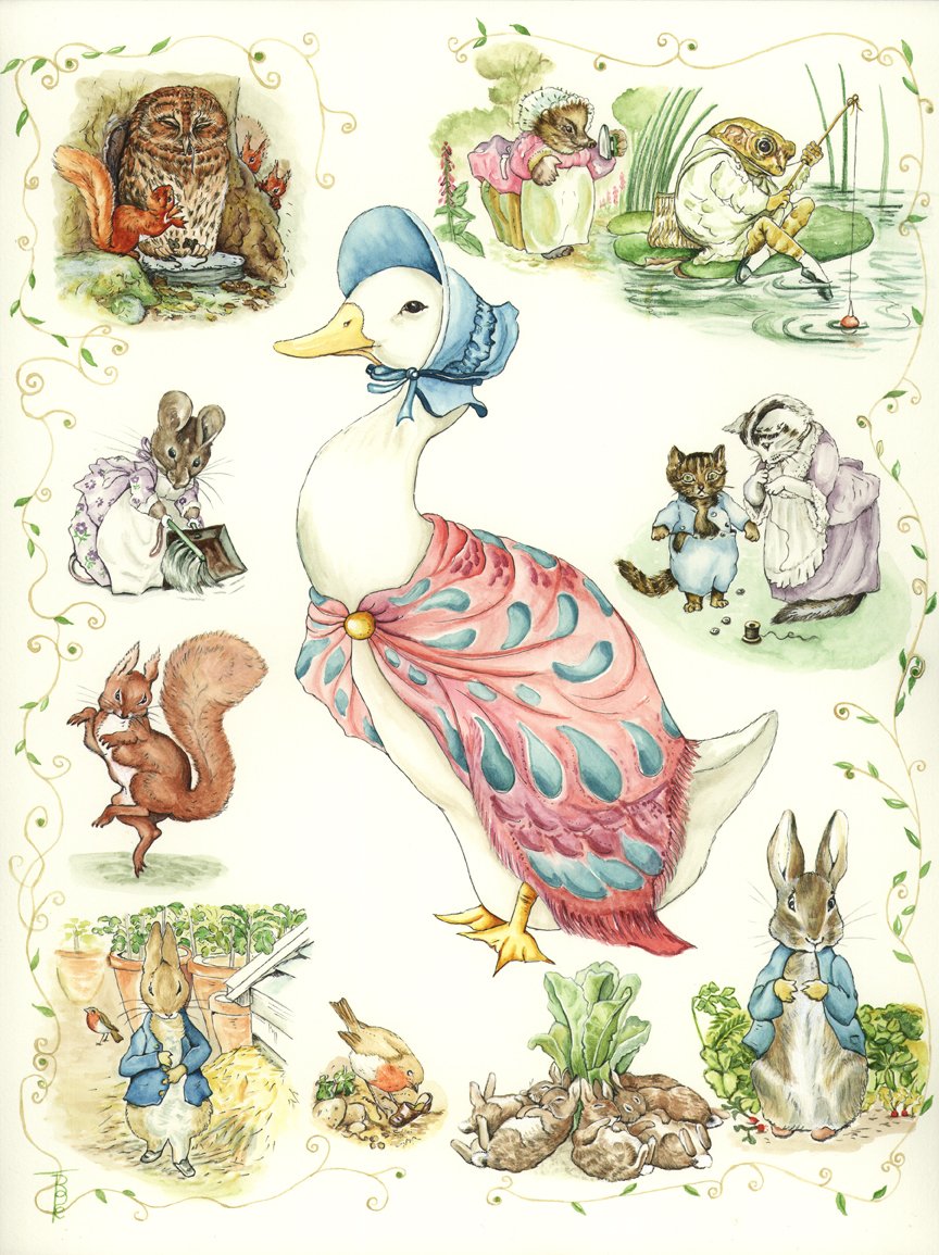
Artist Code 1702 – WATER COLOUR EXERCISE IN THE STYLE OF BEATRIX POTTER Completed 31 December 2017. Original Water colour on Saunders Waterford 300gsm (140lb) 100% Hot Pressed cotton rag paper. Unframed size 12” x 16”.
No products
I have been wracking my brains for a good way to produce the illustrations for the series of riparian booklets (RIVER FRIEND SERIES) which my co-author and I, Sylvia Haslam, are preparing for publication. (Six books have been published as at December 2020 and several more are in preparation.) Also, the type of paper I should use is causing me slight concern. I have always used Arches for my botanical and natural history water colour works, but thought I should try a new media base and chose Saunders Waterford.
The history of this paper: “Saunders Waterford is an exquisite English water colour paper, traditionally made on a cylinder mould machine. This is the superior quality paper made at St. Cuthberts Mill and comes with the Royal Water colour Society’s endorsement. Made using 100% cotton, the highest quality paper making material, to archival standards. Each sheet is buffered with calcium carbonite to help defend finished pieces of work from discolouration caused by acids present in pollution. The paper has a creamy white colour and its attractive surface is created using natural woollen felts that give a distinctive random texture. The surface is coated in gelatine making it strong and resilient to scrubbing and other rough treatments without the surface tearing. Why use a block? Using a block means you do not need to soak and stretch the paper. Glued on all four sides, the paper remains stretched and cockle (buckle) free. Especially useful for painting on location.”
I have always been a great fan of the work of Beatrix Potter so decided to emulate her style to try out the new paper. I believe she was a great artist in her field of simple but effective illustrations. Her natural history pieces and realm of fantasy animal characters show just how skilled she was. They say that all artists can improve their skills by copying the “Masters” – and I place BP in this category”. I decided to delve into her work in detail, finding out as much as I could about how she painted. I discovered that she only used 6 colours, which I managed to purchase, namely: Antwerp Blue, Crimson Lake, Gamboge Yellow, Sap Green and Burnt Sienna.
It was both easy and very pleasant to work with such a limited palette (something quite out of my character), and was an extremely useful task.
The worst part of this work for me personally is that I love to use white (Titanium mostly) rather than leave white space on the paper, and I must confess that I did use a bit here and there, but mostly I was pleased that I managed to be good and leave the white space.
Although I tried to find out if BP painted first and inked in afterwards, I was unable to obtain the information. I went with my gut feeling and inked in over the paint. I liked the effect! This has been a truly remarkable learning curve and wonderful exercise in the art of water colouring.
There appears to be a lot of controversy surrounding copyright and BP’s characters, and I do not wish to get into trouble, so I shall not be producing any prints or cards of this exercise piece.